Developing a cohesive brand to unify the world’s largest, independent, mission-critical logistics company.
SERVICES
• Logo design & visual identity design
• Corporate identity design
• Brand guidelines
• Presentation design
• Brochure design
• Website design
• Icon design
• Marketing collateral design
• Livery design
BACKGROUND
One of the world’s largest, independent, mission-critical logistics providers, MNX had a history of handling critical, time- and temperature-sensitive shipments making them a trusted partner for Fortune 500 companies. As MNX continued to grow, they saw an opportunity to position themselves as an attractive acquisition for an equity partner.
OUTCOME
After extensive research and getting to understand MNX’s ethos and its rich history, we developed an updated brand identity to help them really grab their potential partners’ attention. The visual identity was built to be highly flexible so that it could adapt to the variety of use cases MNX needed. Additionally we designed out a completely new website along with a robust set of marketing collateral deliverables

In the high-stakes world of mission-critical logistics, every minute counts and precision isn't just valued—it's essential. MNX Global Logistics stood as a trusted independent provider in this demanding space, orchestrating complex shipments that most would consider impossible. From time-sensitive medical supplies to delicate aerospace components, their expertise spanned industries where failure simply wasn't an option.
What set MNX apart wasn't just their global reach or technological capabilities—it was their proven ability to handle the extraordinary. Whether transporting airplane engines, coordinating the movement of radioactive medicines with specific half-lives, or even arranging safe passage for marine life like walruses and orcas, MNX had earned their reputation as the go-to partner for Fortune 500 companies facing complex logistical challenges.


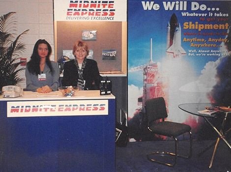
HISTORICAL IMAGES / BEFORE STATE | PHOTO CREDIT: MNX GLOBAL LOGISTICS
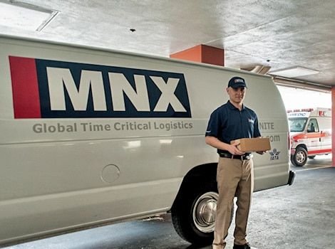

As MNX continued to grow through strategic acquisitions, they found themselves at a crucial crossroads. While their operational excellence remained unmatched, their brand experience had become fragmented—a natural consequence of rapid expansion. This disjointed presentation wasn't just a visual concern; it impacted the consistency of their client experience across global touchpoints.
With aspirations of positioning themselves as an attractive acquisition target, MNX recognized the critical need to unite their various operations under a cohesive brand identity. They needed a visual strategy that would not only reflect their operational sophistication but also communicate their value to potential equity partners.


THE PROCESS
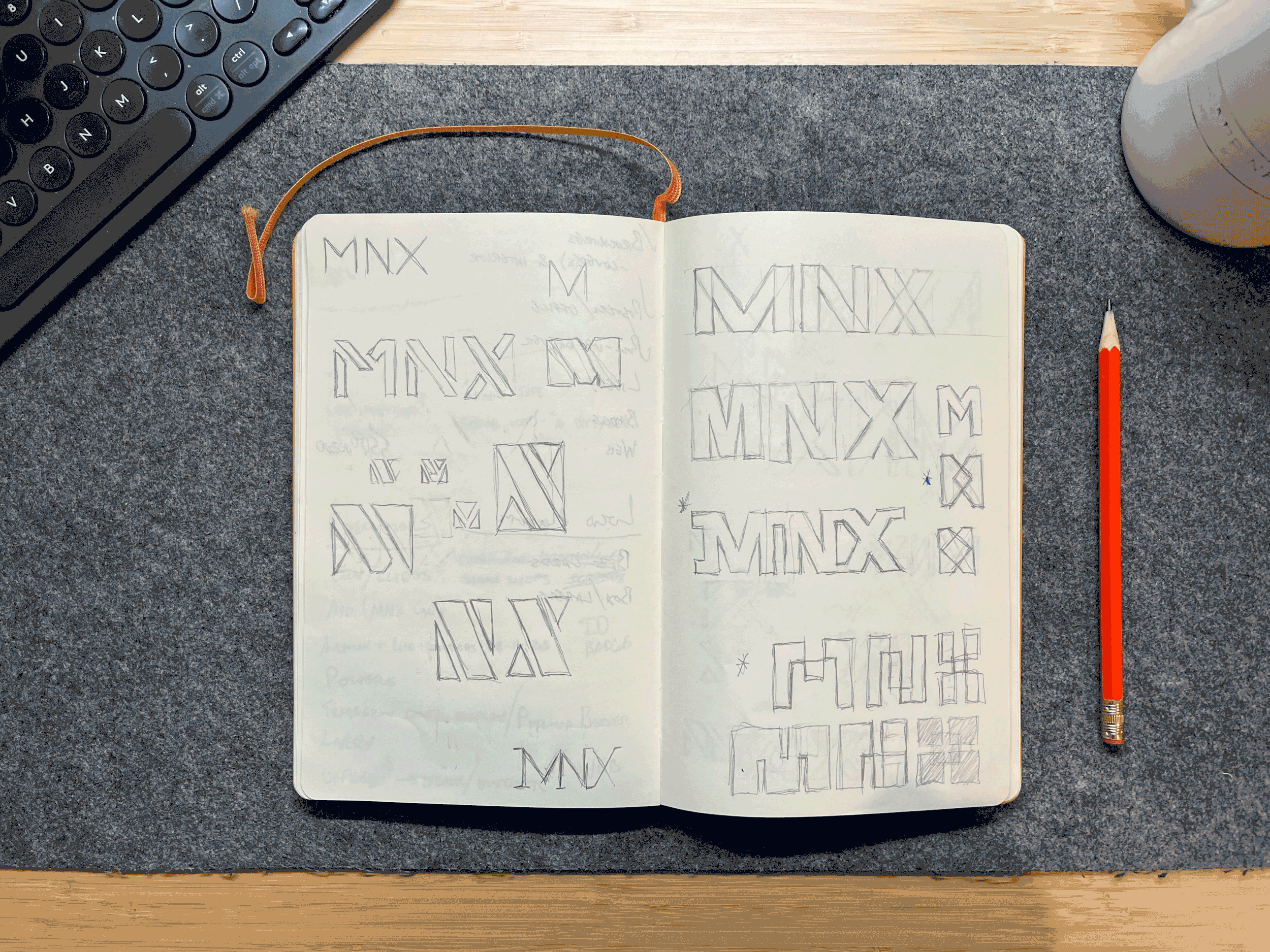
Our journey began with comprehensive discovery sessions, immersing ourselves in MNX's world through stakeholder interviews and extensive brand audits. We examined their current market position and competitive landscape, identifying opportunities to visually differentiate MNX while honoring their rich heritage in critical logistics.

Working closely with brand strategists to leverage the updated verbal components of the brand being developed, we created three distinct visual directions through detailed stylescapes. Once the strategic direction was selected, we crafted a comprehensive visual identity system that could flex across their global operations. Given MNX's worldwide presence, we knew the brand would require an adaptable and flexible system that would ensure each element—from marketing materials to vehicle livery—would contribute to a unified brand experience.


THE OUTCOME
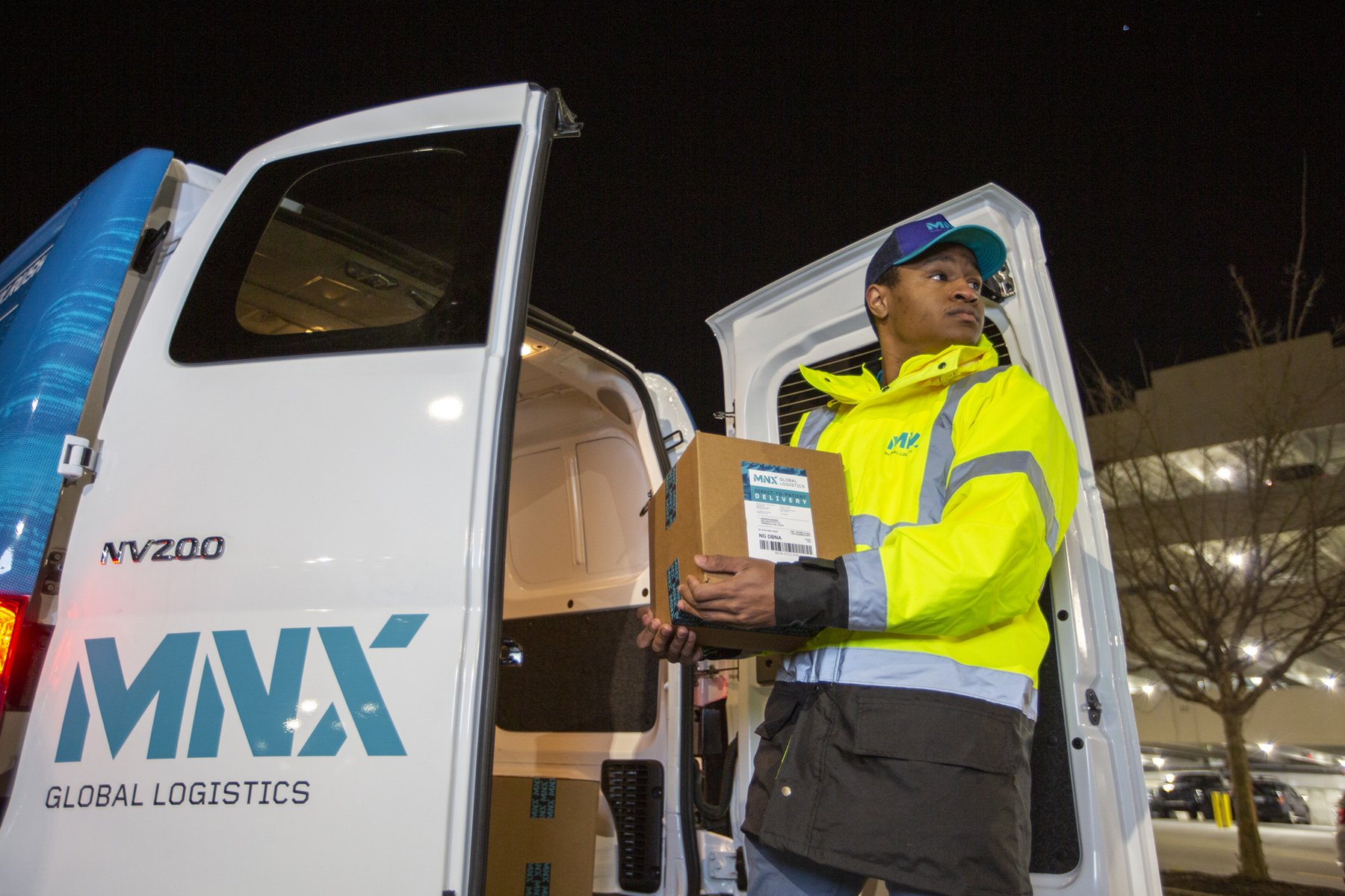
The new visual identity we created for MNX is both a testament to their heritage and a bold step into their future. The redesigned logo features structured letterforms with a distinctive stencil styling—a thoughtful nod to traditional shipping crate markings. The extended upper arm of the 'X,' shaped as a parallelogram, symbolizes both motion and MNX's commitment to going above and beyond for their clients.


The broader visual system employs a sophisticated color palette anchored by Midnight Blue—a reference to the company's origins as Midnight Express. We complemented this with Dark Blue, Teal, and Light Blue tones, accented by vibrant Red and Orange inspired by the high visibility gear often worn by technicians and couriers. The typography pairing of Foundry Gridnik and Roboto provides both personality and clarity, while our unique photographic treatment offers remarkable flexibility across applications. From website design to vehicle livery, presentation decks to trade show graphics, every touchpoint was carefully considered to support MNX's position as a premium logistics partner.


THE IMPACT
The redesigned brand identity played a pivotal role in MNX's strategic evolution. By unifying their visual presence across global operations, we helped create a more cohesive and compelling story for potential partners. This strengthened market position contributed to continued growth and ultimately culminated in a successful acquisition by UPS for approximately $1.3 billion.
More than just a visual refresh, our work helped MNX articulate their unique value in the critical logistics space. The new identity system provided the flexibility and sophistication needed to communicate with diverse audiences while maintaining the precision and professionalism that had always been at the core of their operations. Through thoughtful design choices and strategic implementation, we helped MNX transform their brand into an asset that was as valuable as their operational excellence.

CREDITS & COLLABORATORS
- Joseph Olender / Strategy
- McNeal Maddox / Strategy
- Matthew Muller / Creative Direction
- Barry Yang / Video & Photography
- Edwin Benavides / Video & Photography
- Ryan Adams / Digital Production
- Prospus / Web Development
Created at Innovation Protocol